


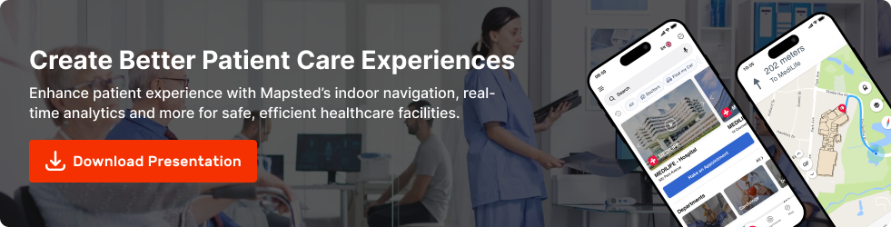
Hospitals & Healthcare

Hospital management is challenging. With maintaining patient care, limited resources and managing staff schedules, it can often feel like juggling 10 things at once with one hand behind your back. And so when we say “heat maps” are helpful, we are not talking about another buzzword. We’re talking about an actual, actionable tool that has real-world applications — and more hospitals are beginning to acknowledge it as such. Let’s demystify this concept—what is heat map, how does hospital heat mapping works and how it can make your staff scheduling and your overall work flow much less nerve-wracking?
This blog is for hospital administrators, facility managers and healthcare decision-makers who are sick of guessing and want real-time, visual answers about what’s happening inside their facilities.
What Exactly Is a Heat Map in a Hospital Setting?
Think of a heat map as a live, visual report of how people move through your hospital. Instead of scrolling through spreadsheets or habitually counting footfall, you are treated to a colour-coded display showing you where things are busiest — sort of like a weather radar, but for people.
With tools like Mapsted Flow’s Heat Map Visualization for healthcare workflow optimization, you’re not just getting pretty visualizations, but actionable data. It shows real-time foot traffic, highlights problem areas and even helps forecast how people move during different times of the day. You’re basically watching the rhythm of your hospital play out on a screen.
Why Do Hospitals Need Heat Maps?
Hospitals aren’t shopping malls. You can’t afford to have people wandering around or waiting too long. You also can’t guess when it comes to where your nurses, doctors or support staff should be.
This is where heat maps prove their value. Instead of reacting after a bottleneck happens—like a sudden patient rush in the emergency room—you can plan in advance based on historical traffic patterns.
Imagine knowing:
- Which entrances are most used at specific times of the day?
- When does the outpatient department get the most footfall?
- Which corridors constantly get clogged, slowing down emergency responses?
With that kind of insight, you can stop firefighting and start planning.
Real Example: Using Heat Maps to Allocate Staff Better
Let’s say your hospital has two main entrances. One is near the emergency department, the other leads to the outpatient wing. During mornings, the outpatient wing gets slammed—patients checking in, waiting, lining up for tests.
Your reception team at that wing? Constantly overloaded.
But your real-time heat maps in healthcare show a clear pattern: between 8:30 and 11:00 AM, that side of the building glows red—meaning it’s packed. Meanwhile, another wing has two underutilized staff members sipping coffee.
Now, with that data in hand, you can:
- Adjust schedules and place more staff in outpatients during those hours.
- Reduce wait times.
- Improve patient satisfaction.
- Avoid burnout among reception and nursing staff.
This isn’t theory—it’s what tools like Mapsted Flow’s heat map visualization can help you do, down to specific hours, departments and even hallways.
And there’s data to back this up. A study at an urban academic pediatric emergency department used heat map analysis to match staffing with patient arrival patterns. Before using heat maps, the ER was understaffed during 18.4% of operating hours. After adjusting the staffing based on heat map insights, that number dropped to 5.9%. Even better, significant understaffing—meaning 20% or more—fell from 16.6% to just 3.1%. That’s not a small tweak. That’s a complete shift in how staffing is managed, based on real movement data.
Spotting Bottlenecks Before They Become a Problem
One of the most powerful things about a heat map is that it shows you what you can’t always see with your eyes.
Patients stuck in a narrow hallway. A diagnostic area that always gets jammed after lunch. A lift lobby that becomes a human traffic jam during visiting hours.
When these bottlenecks occur, it slows everyone down — staff, patients and even emergency procedures. Pinpointing these high-traffic locations in advance means that you can do staff allocation in hospitals by:
- Open alternate pathways.
- Stagger appointment timings.
- Re-route patient movement.
- Improve emergency access.
This isn’t just about efficiency. It’s also about safety.
Improving Safety and Emergency Readiness
Hospitals are chaotic enough without adding blind spots to the mix. A heat map shows you where there’s overcrowding—an issue that can be dangerous in emergencies or even a fire drill.
Let’s say you spot a particular corridor that lights up red every afternoon—wheelchairs, stretchers and people packed into a tight space. That’s a safety risk.
Now, instead of waiting for an accident to happen, you can:
- Reassign staff to help with flow.
- Place signs to redirect movement.
- Schedule staggered discharge or visiting hours.
Some Hospital heat mapping even helps guide emergency evacuation planning, identifying the most congested areas and suggesting safer, faster exit routes.
Better Scheduling, Fewer Headaches
Managing a hospital schedule is like solving a constantly changing puzzle. One nurse calls in sick. A department gets overloaded. Another one is underused.
But heat maps make this puzzle easier to solve by showing real-time patterns:
- Where does your staff spend the most time?
- Are they walking more than they should between stations?
- Which departments need more hands during peak hours?
Instead of relying on guesswork or old data, you now have a moving, updated map of what’s happening. You can adjust staff rotations, shifts and assignments accordingly.
And hospitals that have implemented this approach are seeing real results. Facilities that use detailed utilization tracking—including heat maps—have improved their resource allocation accuracy by over 30%. By analyzing historical movement data, they’re able to better anticipate patient needs and plan, instead of scrambling when things get busy.
Helping with Accessibility
Not all visitors are created equal. Some need wheelchairs. Some are elderly. For others, they may require more time or space to navigate.
Heat maps also show you under-served areas that are not well accessible. Or maybe a ramp leads to a hallway that’s always full. Or the elevator bank is perpetually busy during visiting hours, which is hard on mobility-impaired individuals.
When you know these things, you can act:
- Assign volunteers or staff to guide visitors.
- Open new pathways or resting areas.
- Design routes that are smoother and safer for everyone.
It’s a simple change, but it makes a big difference in how people experience your hospital.
Tech That’s Easy to Use (Finally)
A big hesitation many hospitals have is that they think these tools are complicated. But something like Mapsted Flow doesn’t need an IT degree to figure it out.
Their heat map visualization is plug-and-play—you can filter time, department or location. You don’t have to pore over Excel files or reach out to an analyst. You simply look at the colours, identify the hot zones and respond.
A smart hospital management system is designed for facility managers, floor supervisors and hospital admins — not data scientists.
Using Heat Maps to Plan the Future
You can also use historical data from heat maps to plan building upgrades, shift strategies, patient flow optimization or service expansion.
For example:
- Thinking about adding a new outpatient check-in counter? Check the traffic pattern from the past 6 months.
- Not sure if your weekend staff is enough? Look at heat maps from previous weekends.
- Wondering if your signage is working? Heat maps can show if people are getting stuck in certain zones.
Instead of gut feeling, you make calls based on real movement data.
One Step Closer to a Smarter Hospital
No matter how advanced your technology is, it needs to help you make better decisions, not add more confusion. AI-powered heat mapping is one of those rare tools that actually make life easier—more visual, less guessing.
Whether you’re trying to shorten patient wait times, reduce staff fatigue, improve accessibility or just keep the hospital running smoothly—heat maps give you clarity.
And hospitals are already starting to use tools such as Mapsted Flow, to make day-to-day decision making easier and more streamlined, to keep workflows flowing and to know when things will be busy or emergencies will strike.
Real-World Case Study: How One Emergency Department Fixed Its Staffing Issues with Heat Maps
This isn’t just theory—let’s look at how one hospital actually used heat maps to fix a real problem.
A pediatric emergency department at a major urban academic hospital in the U.S. was dealing with a common challenge: residents were either overwhelmed during busy hours or idle during slower periods. They knew the issue wasn’t about having too few people overall—it was about poor timing and misaligned schedules.
So, what did they do? They turned to heat maps.
With Microsoft Excel-based heat-mapping tools, they mapped just when patients were coming in throughout the day. The visual data told a straightforward story: mornings, especially between 7 and 11 a.m., were chaos. Too many patients. Too few staff. Later in the day? The reverse—staffed to the gills and underutilized.
From all of this, the hospital did not staff up again. They had just adjusted current schedules based on real patient volume.
And the results?
- Understaffed hours dropped from 18.4% to 5.9%.
- Significantly understaffed periods (20% or more) plummeted from 16.6% to just 3.1%.
That’s a huge improvement without spending extra money on staffing.
This case study, published in the Journal of Graduate Medical Education (PMC8325434), is a solid example of how visual tools like heat maps can solve real-world staffing headaches—quickly and cost-effectively.
If it worked for them, chances are, it can work for your facility too.
Final Thoughts
Hospital workflows will forever be complex. But that doesn’t mean you need to play duck, duck, goose with managing them.
Heat map visualization gives you your first clear, visual grasp on what’s happening inside your space—when and where and how. It’s not about more data. It’s about better decisions for smart hospital technology.
Hospital heat mapping means better decisions mean better care. If you found this blog helpful, please read our blog on “What Is In-Store Heat Map Technology and How Does It Work?” or watch our video on “Redefine Location Intelligence with Mapsted Heat Mapping” to learn more.
Frequently Asked Questions
Q1. What exactly does a hospital heat map show?
Ans. A heat map indicates where patients are spending most of their time in your hospital. It highlights crowded places and allows you to observe traffic patterns as they change.
Q2. Can heat maps help reduce wait times?
Ans. Yes, By demonstrating when and where patients congregate, you can modify staff schedules and improve check-in or treatment processes to reduce wait times.
Q3. Are heat maps hard to set up or understand?
Ans. Not at all, Something like Mapsted Flow is designed to be intuitive. You don’t require a tech team to use them — just mediocre training.
Q4. Will heat maps help during emergencies?
Ans. Definitely, They can indicate places that are susceptible to becoming congested, allowing you to plan smoother evacuation routes or send emergency teams where they need to go quickly.
Q5. Can small hospitals or clinics use heat maps too?
Ans. Yes, Even smaller facilities can benefit from understanding how people move through their space. And it’s not just for big hospitals — better flow benefits us all.


