Technology Trends

Whether you’re trying to persuade a customer into buying a product, close a deal with a prospective decision-maker or influence a group of company executives, one of the most powerful tools you can use is data-driven storytelling. There have been many studies that show how executives and managers use data in their decision-making process, for example: here’s a study on how retailers are keeping up with consumers using behavioural data. It shows an ever-growing trend where corporations are relying on data-driven decisions.
COTA aids agents in enhancing their efficiency and precision in addressing support tickets, showcasing Uber’s commitment to streamlining customer service through the use of analytics data. Since you’re already an expert in your industry, it can be easy to assume that the people outside of your role will understand the numbers as much as you do. The truth is, many people outside of your organization won’t have the same level of understanding as you.
Highlights: How to Persuade a Customer to Buy Your Product with Data-Driven Storytelling
- Primary Focus: Learn how to persuade a customer to buy your product using strategic, data-driven storytelling.
- Definition Simplified: Discover what is data-driven storytelling is and how to use storytelling with marketing analytics to turn raw data into relatable stories.
- Emotional Connection: Understand how to use storytelling to influence sales decisions by merging data, visuals and compelling narratives.
- Real-World Applications: Explore how have industries like trade shows, museums and sporting venues leverage data to develop a strategy that boosts engagement and operational efficiency.
- Tech-Powered Insights: See how Mapsted’s tools provide accurate, real-time location analytics to build data stories that captivate and convert.
- Ethical Storytelling: Learn why maintaining objectivity and data integrity is essential to building trust and brand credibility.
- Actionable Strategy: Master the steps in developing a successful data storytelling framework that aligns with your business goals.


In early 2018, Uber introduced a Customer Obsession Ticket Assistant (COTA), an innovative tool leveraging machine learning and natural language processing.
This is why data storytelling is so important. By using visuals to convert those numbers into a compelling story, you can transform otherwise boring or confusing numbers into clearly understood concepts. And when your audience truly understands what you’re communicating to them, they are much more likely to take the action you desire.
In this post, we’ll explore:
- What data-driven storytelling is and why do you need it
- How to develop a strategy for persuasive data storytelling
- Data-driven visualizations that tell a story in action
What is Data-Driven Storytelling?
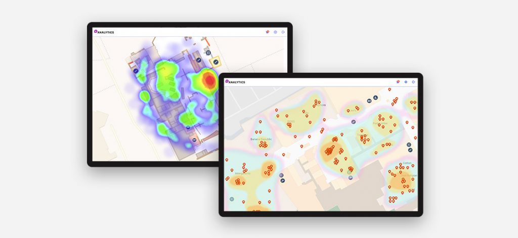
Data-driven storytelling is the process of transforming a data-based analysis into easily accessible visual forms that influence the business decisions of your target audience. You need to use the right analytical facts that intrigue your potential customers enough that they want to take immediate action on your offerings.
How well you do data storytelling depends on the stories, subjects, visuals and creativity that you use. When you use cutting-edge tools and technologies, such as Mapsted’s Analyze, to stitch together different metrics and reveal the relationships between them, you are virtually building an entire world of narratives.
What you’ll need to do is pick one or two narratives, find the data that supports them and build a plot that presents complicated concepts in a form that a person now well-versed in the subject matter can understand.
Show, don’t tell. People prefer visuals. In fact, over 90% of the information stored in our brains is in the form of visuals. Combining creative content with associated visuals increases engagement as compared to blogs, articles and whitepapers that use only text. Using Mapsted’s data visualization and visual analytics tools will help you create interactive and visually appealing presentations that offer actionable insights.
How to Create the Right Data-Driven Storytelling Strategy
Data-driven storytelling can help your business influence the decisions of any potential client, customer or partner. To find the perfect balance between data and creative writing, you need to implement a strategy.
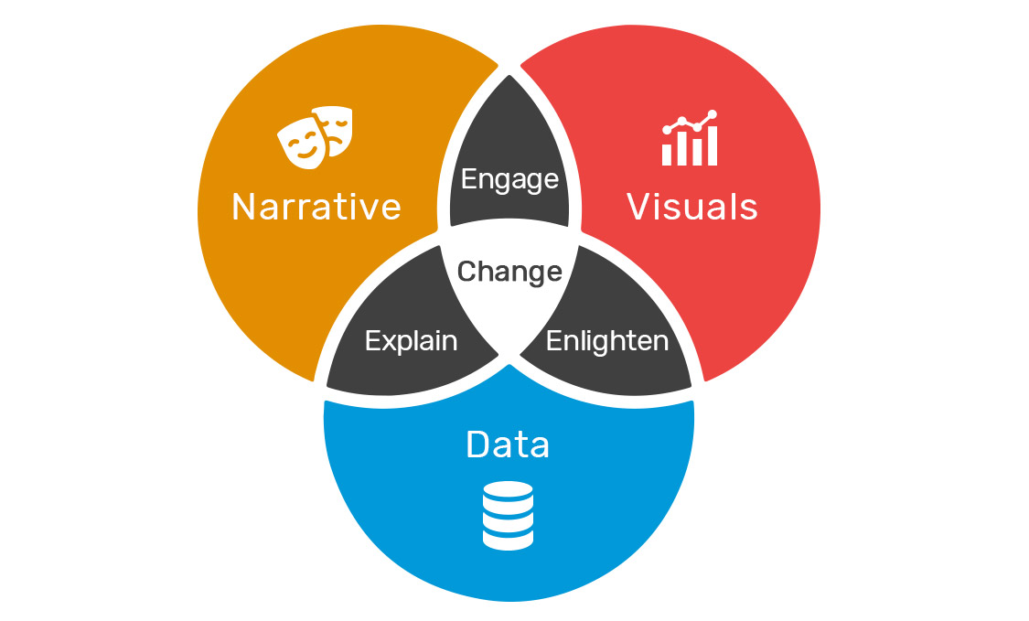
As you can see from the diagram above, a narrative helps explain data, visuals help engage content consumers and data provides insight to convince the customer to do something. When all three elements come together in harmony, they help bring about change in the form of sales, project or process buy-in or conversions.
When you package up your insights as a data story, you build a bridge for your data to the influential, emotional side of the brain.
A Great Narrative
In order to create the right data-driven story, you must create a compelling narrative. No matter how creatively you package your data, it should not bore your audience. The whole purpose of data-driven storytelling is to capture your potential customer’s attention and this involves creating a storyline or narrative. If you’re at a loss as to how to present your data story, you can take a cue from the old “ Choose Your Own Adventure” books you grew up with. Let your audience choose the story they see. By using Mapsted’s Analyze and interactive visualization, you can keep your audience involved in your content.
While you want your data-driven story to be engaging and compelling, you must be objective. There are many documented cases of businesses manipulating data to fit their desired narratives. While the numbers in these studies were left untouched, the way they were presented led audiences to false conclusions.
One infamous case of data manipulation involved the number of COVID-19 cases in the U.S. state of Georgia. An article in Atlanta magazine recounted how the official state COVID dashboard showed data in non-chronological order as if to lead users to believe that the infection trend was going down:
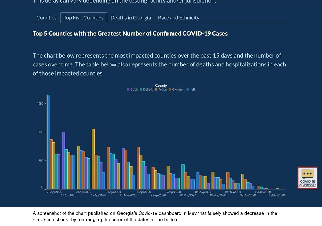
The error above was just one of many mistakes that the dashboard’s users discovered. There was an overall sentiment that the data was not being handled carefully enough. Many users even believed that there was an attempt to make the data fit a narrative that was far from what was actually going on.
Mapsted excels in providing the ultimate data storytelling experience with its unmatched accuracy. Unlike others, Mapsted ensures the purity of data, using it to convey the unadulterated truth. Through robust technology, Mapsted Analyze effortlessly transforms data into intuitive dashboard visuals, allowing for thorough analysis. With real-time location intelligence and interconnections between datasets, our solution enhances the narrative, presenting a comprehensive and contextual understanding.
Some of the best uses of Mapsted Analytics are:
Tradeshows
For tradeshow organizers, Mapsted Analyze offers valuable insights to assess the potential success of a chosen location. By leveraging past data as a reference, Mapsted Analyze creates an informative visual narrative that uncovers probabilistic insights. This information can help in making informed decisions about selecting a location that maximizes opportunities for tradeshow success.
Museums
Museums can leverage the visual narratives provided by Mapsted Insights to offer visitors more than just an immersive experience. By transforming location data into heat maps, managers can identify areas where visitors spend the most time. This valuable information aids in strategic decision-making regarding the placement of advertising materials, concession stands and merchandise venues to enhance engagement and interaction at key moments throughout the museum.
Sporting Venues
In large sports venues, visual narratives derived from location data empower decision-makers to monitor the utilization of facility areas such as bathroom stalls. This information enables the effective scheduling of maintenance workers to clean the stalls based on usage frequency, ensuring cleanliness in crowded areas. Additionally, the location insights generated by Mapsted Analyze have the potential to aid in future pandemic situations, such as COVID-19. The wealth of information can assist in creating emergency plans to minimize the risk of virus transmission within the facilities.
Final Thoughts
When you do data visualization and storytelling, your credibility is at stake. Maintaining your objectivity and sticking to the facts will help you maintain your brand’s credibility. Whether you’re writing for end-users, casual readers, CEOS, or tech evangelists, good data storytelling transforms otherwise confusing or boring data into compelling visuals that get remembered, influence decisions and spur action.
Data storytelling should always begin with respect—both for the data and for your readers. Let the data drive your narrative and use the visuals to empower your audience to make informed decisions. You can unlock the potential of powerful data storytelling with the perfect technology that amplifies your narrative through compelling data representation. Mapsted has all the right features readily available, empowering you to make agile decisions.
Don’t miss out – reach out to us today to discover more about our offerings and revolutionize your data-driven storytelling.
If you like this read, we have more for you. Check out this blog on why location-based marketing is important for businesses. Did you also know that location analytics is possible without Wifi? Don’t skip reading this, as well.
Frequently Asked Questions
Q1. What is data storytelling?
Ans. The essence of data storytelling is the use of data to connect narratives and visualizations. It provides the appropriate context for the audience to make decisions.
Q2. Which best defines data-driven storytelling?
Ans. The simplest way to summarise data-driven storytelling is to transform raw data from disparate sources into relatable stories. Visuals used to enrich data improve its structure and how people interpret it.
Q3. Why is data storytelling important?
Ans. Standardizing data to increase its penetration is the key to successful data storytelling. In a nutshell, data storytelling has been shown to be extremely beneficial because it connects perspectives and makes information easy to consume.
Q4. How does a marketer use data storytelling?
Ans. Marketers use data storytelling to gain insights and engage effectively. They help create high-quality and personalized content using data storytelling.
Q5. What makes a great data story?
Ans. A great data story requires the following:
- Relevancy
- Quality data
- Clarity in the story
- Unambiguous visuals
- Audience feedback
- Highlighted data
